Visible invisibles
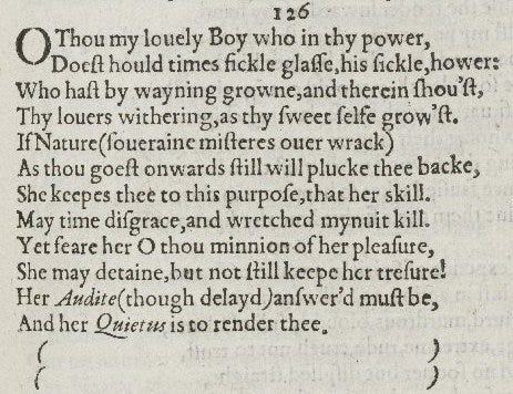
Here is Shakespeare’s sonnet 126 – ‘O thou my lovely boy who in thy power’ – as it appeared in 1609, in Shake-speares Sonnets: Neuer before Imprinted, printed by George Eld for publisher Thomas Thorpe.
Amid what look like some eccentric choices in spelling and punctuation (I like ‘wretched mynuit kill’), we read that even the beautiful boy of the sonnet, so long the pride of Nature, will eventually fall victim to Time. ‘Her Audite (though delayd) answer’d must be.’ Happy Christmas! The poem is perhaps most notable for having a missing final couplet, a gap conveyed in this 1609 edition through the use of italicised brackets which perhaps trace the shape of a time-tracking hour-glass. The space, and the silence, and the blankness, between those brackets conveys a sense of future loss.
One way to think of the poem is as a response to the problem of how to represent absence. When Gill Partington, Dennis Duncan, and I decided to print this sonnet for a small press exhibition organised by the Bodleian Library, we set the type but inked only the number and the brackets. By pulling hard on the press, we produced the following embossed effect for the rest of the poem.
Is the sonnet here, or is it missing? Or is it here as something missing? Is it coming into being – or passing away? Elements of the poem that might seem to be outside the main text become the only inked presences: the rest is blank. Or not quite blank: uninked, but with a depth that is just about legible. A printed page is normally made up of paper marked with ink pressed on to it; but here, apart from the brackets and the number, the paper is both the receiving surface and the impressing text.
One thing we didn’t foresee: in time, the paper started reverting back to its smooth original state. Because we’d not moistened the page sufficiently, the embossed text gradually undid itself, flattening down, reverting to an earlier, more comfortable state. In a demonstration of the dynamism of paper, of (despite our expectations) the non-static nature of the page, the sonnet drifted slowly towards blankness, save for an inked ‘126’ and those two pairs of brackets.
Here is something similar: ghostly, but more permanent. It’s from a book in the Hunterian Collection at Glasgow University, discussed in an excellent blog post by Robert MacLean, here. It's a copy of Saint Ambrosius’ discourse on St Luke, Expositio in evangelium S. Lucae. You’ve read it, right? The book is an incunable: from the Latin ‘incunabula’, meaning ‘swaddling clothes’ or ‘cradle’, a term describing a book from the earliest years of printing (technically, before 1501). It was printed in Augsburg in 1476, and you can see below that it features 7 lines of uninked, embossed text, not unlike our sonnet 126.
But unlike our absent-present sonnet, this isn’t a deliberate effect. In setting a page with a small amount of text at the top and the rest blank, the printer would have needed some bearing type. Bearing type is there to create a flat surface for the platen to push against, to spread the stress of the press evenly to prevent the type, and the blank section of the page, from being damaged. Bearing type isn’t meant to leave a mark – its role is to invisibly provide support, like an Edwardian butler – but here, in this book on St Luke, the pressman evidently pulled too hard and the result was this uninked but visible impression. This accidental presence – a kind of ghostly slab of text – is interesting for all kinds of reasons, not least because it shows us what else this printer had been working on in the print shop at the same time (he reached for a block of set type, easily to hand, of the right kind of length to fill the vulnerable blank space). It also reminds us that in moments of error, the process of book-making becomes suddenly visible. We see for a moment the hidden workings, the tricks and short-cuts and devices that brought a book into being: the depths beneath the surface of the page.
There’s more detail on this 1476 book at Glasgow, including the blind impression, and the image I’ve used, in a fascinating blog post by Robert MacLean, here.
For more on bearing type, see Random Cloud (cheeky pseudonym of Randall McLeod), ‘Where Angels Fear to Read’, in Ma(r)king the Text: The Presentation of Meaning on the Literary Page, ed. by Joe Bray, Miriam Handley, and Anne C. Henry (Aldershot: Ashgate, 2000), pp. 144-92.
For errors in early printed books, see Sarah Werner’s post here.
For more of the printing Dennis, Gill and I have done, you can visit here.


Lovely, Adam!
Fascinating post, as is Robert MacLean's. As a retired fellow tradesman, I naturally enjoy it when the work and concerns of librarians gets a share of the spotlight (Hooray, FNL saves the Honresfield Hoard for the nation!) but in truth "special collections" librarians are a breed apart, scholarly types lurking in air-conditioned seclusion, while the rest of us toil over questions of underfunding, stock acquisition and processing, shelf-occupancy, and "reader services". I'm afraid digitisation *is* often the answer to these more pressing managerial concerns... So, hands up: we're also the ones who come up with Cunning Plans such as "foliogate"...
On Sonnet 126, as always I look to Don Paterson for enlightenment, but I find he is as baffled by those parentheses as anyone. FWIW, I had always meant -- given the accounting metaphor that closes the poem -- to investigate whether bracketed lines had some significance in book-keeping at the time: "account closed", that sort of thing. But as I'm sure the same thought must have occurred to others and I had work to get on with the impression in my mind gradually faded away to a blank (you see what I've done here).
Mike