Do you know John Pudney? Maybe not. But if you were a British reader during World War II, you would have done. Pudney (1909-1977) was a prolific author of novels, works of history, children’s books, and poetry, perhaps most famous for his popular verse written during the 1940s: Almanack of Hope (1944), Flight above Cloud (1944), World Still There (1945), and the anthology Air Force Poetry (1944). In 1953 he published Sixpenny Songs with John Lane: 32 pages of poems about country life, including ‘Quince Harvest’, ‘Spring’, ‘Valediction for a Branch Railway’, and (less predictably) ‘Aunts Watching Television’. (1953 was the year when the queen’s coronation played out flickeringly in millions of homes.) In 2017 I bought a copy of Sixpenny Songs. The bookseller warned ‘Spine bruised at tail’, as if he was selling me an animal. What arrived was a wonderfully strange bookish-object. It’s the publisher’s mock-up, made from corrected proof pages. The proof pages have quite a number of alterations – new or alternate words, cancellations, revised punctuation – added in ink in the author’s hand: sometimes a single letter, or sometimes an entire line.
At times, the amount of changes is startling, suggesting either an author revising as he proofs, switching his creative mind, or a compositor who had made a lot of slips. Here is the second stanza from ‘Candlemas’, where ‘valley’ becomes ‘sallow’, ‘And’ becomes ‘Yet’, and ‘Are loud’ becomes ‘Mutter.’
These corrected proof sheets served, presumably for reasons of economy, as the text to produce a mock-up of the final layout, and here another hand intervenes with instructions to the printer. This hand rearranges the layout so that titles run on as a single line:
And it adds measurements to fix the placement of text on page (3 ems between top of the page and title; 35½ ems text per page; page numbers in folio font, 11 point, and italics):
Often, as above, a page carries Pudney’s proof corrections and the subsequent prescriptions to the printer. What we see when we read this object is Pudney’s book before it becomes itself: Sixpenny Songs, inching towards its public form. Finished books work hard to efface the busy, messy work of production – all this back-stage business. And while books generally want to exist punctually in the moment of their publication (Printed by Unwin Brothers for John Lane, 1953), it’s better to think of them as processes occurring through time.
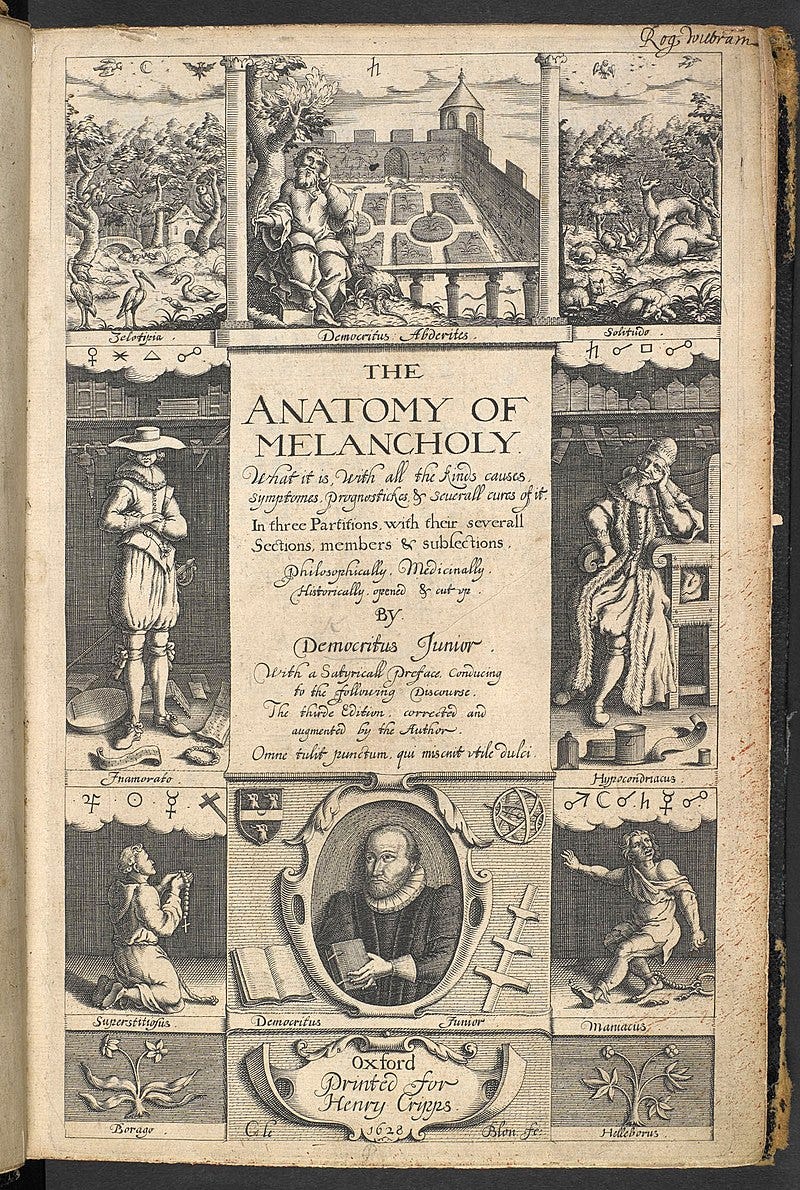
Here is an example from some centuries before. English clergyman Robert Burton (1577-1640) never wrote about aunts watching television, but his vast and encyclopedically erudite Anatomy of Melancholy includes pretty much everything else. It’s a maximal and teeming collection of writings on what might now be called depression – melancholy ‘historically opened and cut up’, as the title-page has it – although Burton, writing under the name of Democritus Junior, has a much wider sense of his subject than we would today. ‘I write of melancholy,’ wrote Burton, ‘by being busy to avoid melancholy.’ The book ranges in tone (at times satirical, at times not) and is brilliantly digressive in structure. Samuel Johnson said it was ‘the only book that ever took him out of bed two hours sooner than he wished to rise.’ It was published in Oxford first in 1621, already hugely long, and then in expanded editions between 1624 and 1651. Here is the title-page to the 2nd edition of 1628:
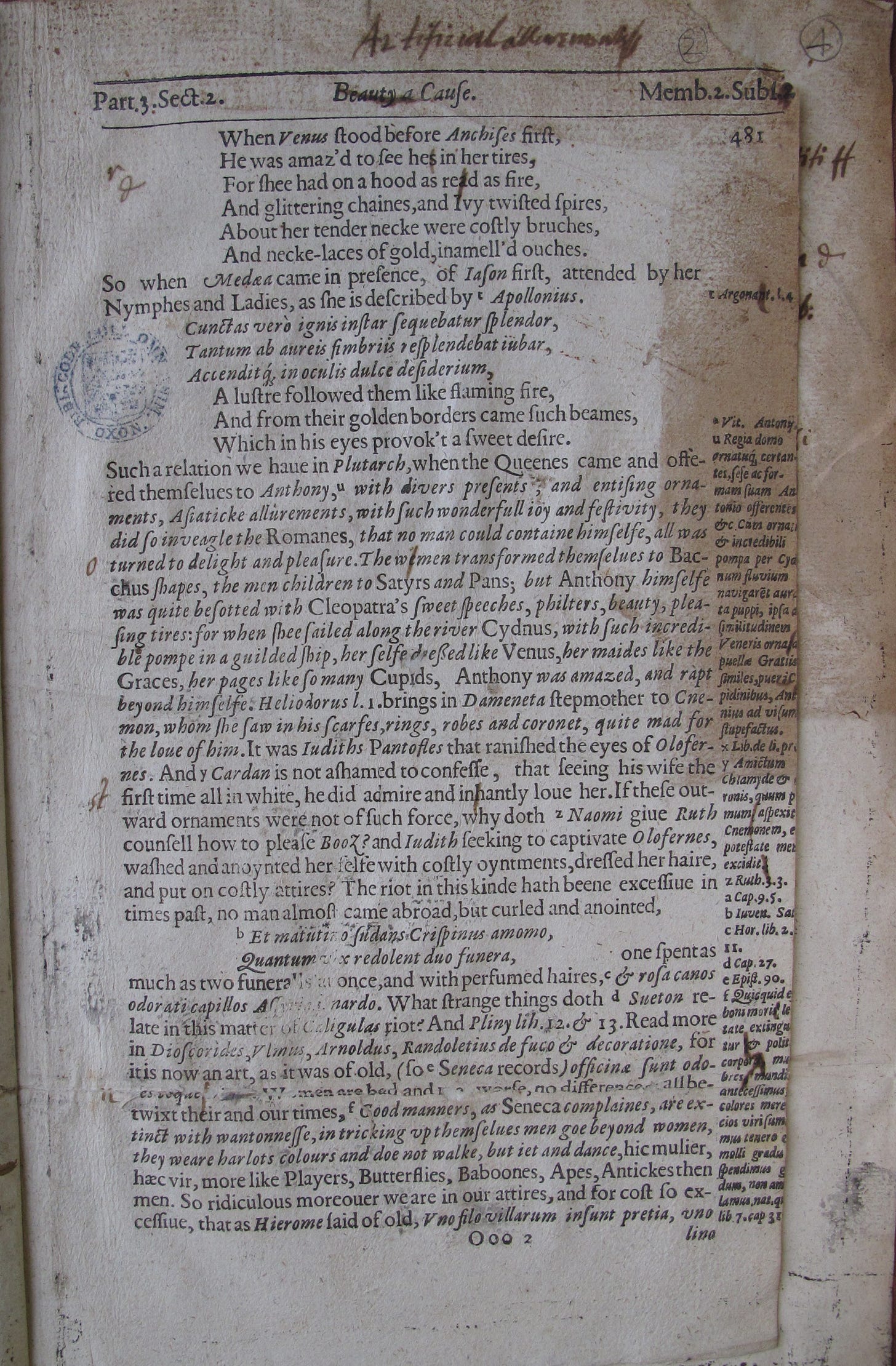
We no longer have Burton’s manuscript copy, but we do have quite a few proof pages, marked by the author’s hand. These survive thanks to the thinnest of threads of bibliographical chance: a number of the marked-up proof pages were used as waste paper in the binding of other books. It looks like an Oxford binder had a pile of these Burton proofs in his workshop, and reached for them as he was binding other volumes: printed pages of Burton’s brilliantly literary writing became material props, things to hold together other things. As the bibliographer Will Poole has noted, the fourth edition of Burton’s Anatomy of Melancholy, from 1632, seems to have been a particularly rich source of waste paper, and there are proof sheets, marked in Burton’s hand, contained within seven books in the Oxford college libraries of All Souls, Queen’s, Oriel, St John’s, and New.[1]
Here is a page or proof corrections from All Souls: it served as an endpaper to the 4th edition of Richard Knolles’ The Generall Historie of the Turkes (1631), but was removed in 1977 by excited librarians. You can see some of Burton’s inky alterations: ‘read as fire’ becomes ‘red as fire’; ‘wemen’ becomes ‘women’. Even canonical authors have to deal with compositors reaching into the wrong compartment of type.
In other volumes, the proof sheets are still in place, doing their job in supporting another text. Here is a copy of Meric Casaubon’s De quatuor linguis (1650) in St John’s College – don’t pretend you haven’t read it! – with a cut-out part of a Burton proof sheet, with a couple of corrections, serving as an endleaf.
And here is a 1630 translation of the 6th century Christian theologian John Philoponus (John the Grammarian to pals), in Queen’s College, with pieces of Burton’s corrections just about visible. The fingers mine.
Burton’s book, here, is snaking through time; its pre-publication lives are today scattered across the insides of other books. There is so much in The Anatomy of Melancholy that it seems almost perverse to find more. But we can see the sheer amount of labour that went into getting a book right, and – in delicate counter-balance – can appreciate that any book is only precariously itself.
[1] Will Poole, ‘Robert Burton and his Anatomy of Melancholy: Some New College Musings’, in New College Notes, here. As Poole notes, these proof sheets were first noticed by Paul Morgan when revising entries for the Short-Title Catalogue, and were later catalogued in J. K. Moore, Primary materials relating to copy and print in English books of the sixteenth and seventeenth centuries (Oxford, 1992).


Interesting to see how printer’s proofreading marks have changed little over the centuries. That line adjustment mark remains pretty much the same - just less panache.